

We all have our stories about how we come to do what we do, the inspirations for our work, the stories we want, or have to, tell. This article is about the process that I went through and what I learned, once I decided to make my first photo book.
- 1. Introduction
- 2. Selecting and Sequencing Images
- 3. Physical Format and Layout
- 4. Proof Books
- 5. Offset Printing
- 6. Proofing and Image Preparation
- 7. Printing
- 8. Shipping
1. Introduction
Here is a summary of the format of the book:
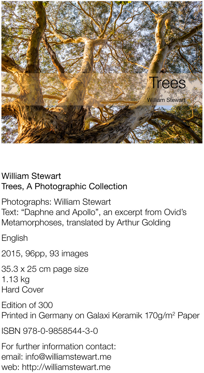
This kind of summary is used on a lot of websites to describe the basic features of a book, and is usually accompanied by a few example spreads of the book. The full presentation of the book on the web can be seen at Albumen Gallery, the primary site where the book is sold and distributed.
What we will cover is how to take these images from the computer and create a book. I am not going to cover basic image preparation and development using software such as Adobe’s Lightroom, Photoshop, Windows Photo App, or whatever you use, what camera you use, etc…, so I’ll assume you’ve got at least that far.
I am going to use the more generic term of “image” or “photo” interchangeably. My book is a book comprising photographs of trees that I have made over some years, but regardless of their source, the starting point is a collection of digital images.
2. Selecting and Sequencing images
I’ve been taking photographs of trees for many years, and had thought about featuring these images in a book. I had a broad range of images to chose from, so the first task was to go through and select favourites, images that in one way or another spoke to me. As I went through, the question that started to emerge was “what was this book about”? Even though you have a sense, a story, in mind, it sill raised questions for me: “Why did I take pictures of trees?” What was this all about?
I had a general notion in mind, a narrative that I thought would guide the selection of pictures, their sequence, but I found it quite hard to come to grips with that, how to chose and sequence pictures that would express and capture that story. I was building a narrative, but the limit I applied to myself was that his narrative would be pictorial, not textual. I had thought to do an ebook on “Trees”, and then, at the last minute, ended up at a workshop in Melbourne on making a photo book and we were given the task of bringing “something” to the next weekend’s sessions. A “real” book, rather than an ebook. It was a great opportunity, and so off here we are, off and running.
I took two approaches to begin with, thinking of more formal methods of sequencing: based on location (California, Australia, Europe, etc), then of date: from the oldest to the most recent pictures, or alternatively of grouping by B+W versus colour. But none of these had really gelled as an approach and it was hard to visualise on the computer screen how it would all fit together.
In the workshop, as we were left with a week to get something together for the presentation the following week, we were advised to print out the images. So, I printed all of the images out (about 100), one per A4 sheet, and stuck them together in an accordion style binding, originally ordered by date (oldest first).
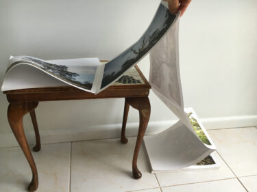
When it came to my time to present my work, I laid out the book as I had it, talked about how I liked the photos, but wasn’t happy with the sequencing at all – it didn’t seem to say anything much at all, and it just looked like a bundle of (maybe nice) photos. A couple of my fellow participants started moving the pictures around, folding the book so that different images would sit next to each other, and I started to get the idea of how I could sequence them.
Having stuck them altogether at this early stage wasn’t really that helpful. It didn’t help to get a sense of how they could be ordered, and even though the accordion style is very flexible for moving things around, and you can make some nice spreads, if the basic structure of the book is not there, then it really gets in the way.
I had also by this time, decided to use the text from Daphne and Apollo (Ovid, Metamorphosis); it describes a relationship, an acknowledgement, of our use, and the utility of, trees, and that relationship was honoured and revered. Trees are, after all, living entities. And it covered the basic idea of what I had been photographing, the trees around us, the relationship we have with them. And with that as a basic story arch, I chose a couple of key images around which to build.
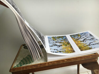
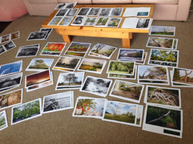
I un-stuck all of the images, and spread them out on the floor. I had decided the first image (which is actually the second image in the final book), the middle, the 3/4’s (which I actually dropped in final production) and the last image. I felt these images provided the basic structure of a narrative.
I also started to be able to construct a story arc (going from natural to urban settings), and matching the images with each other on pictorial attributes: what looked well together.
Once I had this basic foundation, the rest seemed to flow naturally, groupings emerged, and a narrative emerged in the selected images. Having a pool of images from which to chose, the book now took on its own logic, and pictures chosen were there for the narrative, and the consideration of the larger “book” took over from the merits of individual pictures.
More or less the final form of the book looked first like this:
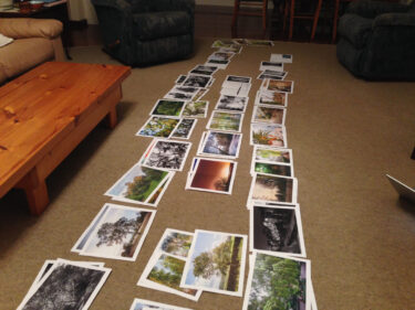
Once I had this laid out on the floor, I left it for a bit, looked it over, and then stuck it all back together, using the same technique. Now, I once again have a book I can leaf through, but I can still re-order or insert pictures by simply cutting through the tape, or even un-sticking it. I used the “unstick” tape; it’s a softer form of cello-tape that you are meant to be able remove, just by peeling it off. Mostly this works, occasionally it will pull the paper off as well, so I’d end up just using a blade to cut through that section and leave the old tape on. I also found that I’d have to repair some of the tape ‘bindings’ as they come undone, but it was pretty robust through about 2 months or so of showing people, constant thumbing through.
I had also originally thought about the accordion binding as one I’d like to use for publication. I do like this as a binding style, but I now really enjoyed the sequencing of the book, could see that it had integrity, and so came to feel more comfortable with the standard book form.

One thing that is worth noting here as well; I didn’t have captions on the pages and there was no text printed where I wanted the text. For the text pages, I just had blank pages inserted where the text would go. This was just about getting the collection of images sorted. It needed to make visual sense, and I wanted something I could show to people, and look through myself, to see if this collection and sequence engaged people, to see if this was something you could look through “as a book”.
3. Physical Format and Layout
Most of the pictures I had chosen were landscape oriented. I also had some diptyches of portrait pictures, which would fit nicely in the same basic space as a landscape image. I had one panorama that would cross two pages, so that all pretty much dictated a landscape orientation.
As I shoot with 35mm, the normal cropping of the image is 3×2. I decided that I would primarily do one image per page, and would have images on facing pages as I liked the pairing, the contrast, that the sequencing had, and images that didn’t sit well with that idea had been removed. I had thought about having blank pages, with just one image on the spread, but this didn’t appeal to me at the time, particularly given the strong pairings that I’d been working through.
I like the ISO series size – it is a little higher than the 3×2 dimensions, but not enough to give you a sense of a too high margin on top/bottom; really it’s a very good fit. I had also decided that all of the images in the book would be cropped to a 3×2 (or 2×3) ratio, rather than having 4×5, or squares, etc… I wanted some formal consistency.
I had a couple of different ideas about captions. At first I put the captions with the pictures, but as I showed friends the mockup, I realised that most of the time, people were just looking at the images themselves, and only occasionally ask me where a particularly picture was from, etc… So, eventually I decided to place the captions at the back of the book, so that the reader would not be forced into the “literal” frame of mind by reading captions: it is hard to see text on a page and not want to read it, or at the very least glance at it. In short, the images themselves would have primacy.
I also decided that the poem would serve to break the flow every now and then, but as a large block of text it becomes something you can ignore ‘as text’, and just see it as a slight break in the page flow, a relief for the eye, otherwise, as you page through it, it would become very dense with full page images on each spread.
4. Proof Books
This was the most disappointing and difficult part of the process for me. I really wanted to do a larger book (I ended up with a page size of B4, 353 x 250mm), and I also wanted to use the “ISO” series ratio. At this point I wasn’t fully commited to printing in a large volume run, so was looking around at digital (small quantity) printing options. This proved quite disappointing on a number of fronts:
Size
I couldn’t get the size I wanted, as most of the digital printing options have limitations on the page width, particularly if you want to do proper (section-sewn) binding.
Binding
There are two main types of binding, PUR (or Perfect) Binding and Section Sewn, at least with a “standard” spine:
PUR Binding creates a spine with a layer of glue, and individual pages are set in the glue. Paperback books are done with PUR binding. PUR bindings mean the printer prints each page as a separate piece of paper, so your printer can print pages as wide as the printer can print. The problem with PUR binding is that the pages do not lie flat, the stick up with a pronounced height and bend that for a full-page photo book is terrible.
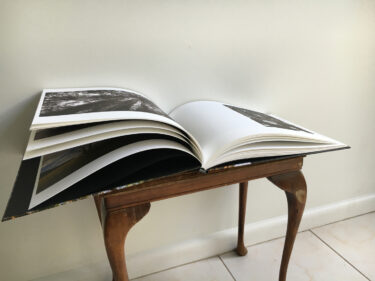
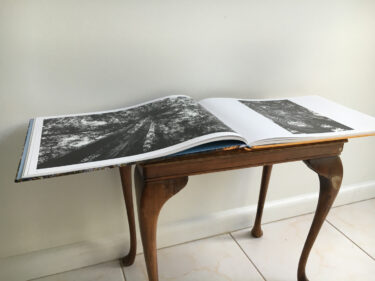
Section Sewn is how most hardcover books are done. Pages are printed across a spread, and then these spreads are folded in half, and sewn together along the fold. The pages are stitched in sections, and these sections are merged to form the spine. As you open the book, the spine can curve inwards, which ultimately allows the book to lie flat.
The first (on the left) is printed by Blurb, PUR bound. On the right is the final production print. The pages are wider on the right, both books have the same number of pages and similar paper weight.
The problem, at least for digital printing, is that you have to print on a single piece of paper that is as wide as two of your pages: this is called a spread. For a book of any significant width, most digital book printers will not be able to do this, they just aren’t readily available and even high end, boutique printing houses have (at least for my project) onerous limit on the width of the book that can be printed using section sewn binding.
Now, there are actually more than 2 types of bindings… There is spiral binding, which prints individual pages, and puts a spiral down the centre, so it solves the PUR binding lay flat problem without needing larger width printers. There are some more specialised “lie flat” options for single page printing, where the pages can be attached to a fabric or other material that is then bound, basically these options are to solve the “lay flat” problem of PUR binding, within the page width constraints of most digital printing options. Compared with the elegance of a section sewn book, these are all compromises in my view.
There are also other options and plenty of more boutique types of choices that can be made to solve this problem: Cantilever (or Accordion) style binding (as seen above) can be quite beautiful and interesting as it allows you to display the book in all manner of different ways, and there are emerging some nice packaging options in boxes, etc, that provide some robustness. It is an area well worth investigating, and quite fun to see how this is being explored.
To some extent, the problem I was coming up against was simply put: most digital printers do not print wide enough for a decent sized photo-book that can be properly bound. From what I understood at the time, offset printing, which prints on large sheets of paper, which is then cut down to the book’s spreads (and ultimately its pages), was the only way to go.
As a side note: After I had printed the book, I spoke with my printer (Daniel Grammlich) about doing Digital printing. To my surprise, they are able to actually do quite wide books (up to 315mm page width with a hard cover and section sewn) as they actually invested in a Digital Printer that can do wide sheets! I had come to think that Digital printing was pretty much useless due to this size limitation, but it turns out that its actually a problem of investment and business, not technology: that is, most people offering digital printing are using printers that are small, and are not catering for larger books. But the printers do exist, so small volume, larger format digital printing is actually a possibility if you can find a printing house that will do it.
Blurb
I thought this would be a great option, they are a large company, their specialisation is with photo books, they have marketing and distribution/fulfilment options. However, their small run printing is limited on width, so any of their larger format landscape books are PUR bound, the photo above is from one of the two blurb books I had printed.
One of the concerns I came across though was the cost: cutting corners to a book that was roughly what I wanted was going to cost about US$80/copy just to print. Then, they only offer a set of pre-set sizes, really those sizes are too high (too square a page format) for my idea, but I wanted to actually hold a copy of what a book would be like in my hands, so I re-laid it out to their large landscape size, and ran off a copy. I was disappointed in the results, several pages had printing problems (streaky ink, etc). I wrote to them and they agreed to credit the cost, so I could do a second printing. I decided to change the paper, to use their highest quality, matt paper. This would be an expensive option (about US$170/book to print). I was also disappointed with the result, the colours were what I had wanted, the b+w images seemed dull and lifeless. Its not that there was anything particularly wrong with the images in this print run, they just didn’t sing, didn’t print in the way I had expected them too, and as I had already printed these images it was disappointing to see the results, particularly for the cost involved.
From what I had hoped would be simple, send and print option, to an end product, through Blurb or other “digital” printing options, just did not cut the mustard, I was not convinced I would get the richness of colour I wanted. Even disregarding cost and print quality, there was still the fundamental problem: PUR binding just wasn’t going to do at all.
5. Offset Printing
One of the main problems with Offset printing is the commitment that needs to be made to a volume: 300 books is a minimum, 500 really is better from a cost perspective, and it gets more cost-efficient the more you print. Offset has a large setup cost, the process involves the production of aluminium sheets for each ink (and lacquer coating if you use it). The actual cost of the paper and ink is actually quite trivial in comparison, which is why it gets cheaper the more you print.
I looked at various options: a lot of people in Australia use printers in Asia, Singapore, HK/Mainland China seem to be the most common options. Coming in as a small, self-publishing author, I was concerned that I really didn’t know enough about the process yet, and thus that I would get something I would be happy with. I had reasonable quotes for runs of 300 from companies in these areas, but then it was just down to business: if the quote is ok, send us your files, and we’ll send you the books. There was no allowance for proofs, no suggestion I could come to the printing, etc. It seemed quite a risk to take, I could end up with 300 books that I just didn’t like, and particularly having already had two from Blurb, I was loathe to make that commitment.
I had seen a few books printed by a firm in Germany (Offsetdruckerei Grammlich), so I called them, sent a follow up email, and got a quote with various options (quantity, etc…). They also included the comment: “we’ll look after you” and that sold me on it. I knew I didn’t know much, so having someone tell me that they considered getting a good quality product out as much their job as mine, really made me feel like I could go with them, and having seen their product in a number of books gave me the confidence to go ahead. The cost was higher, but not that unreasonable.
Even though it wasn’t the most economical, I went with 300 copies; I had no idea at all how I would sell the books, and all of my previous investigations with digital printing had been about trying to do few copies, just to minimise the eventual storage problems, etc. With some rough sums, I figured that I could break even on a reasonable retail price, but probably would look at a manageable loss. If the book was successful and I could afford a second run, that was where I would make any money. From my point of view, this was fine for my first book, this was about education and learning, not profit, and I was already learning a lot.
6. Proofing and Image Preparation
One of the concerns I had had was wanting to do actual proofs, to see the pages as they would be printed, so that I would understand how it was all going to look before hitting “go”. Proofing is expensive though, so my first pass was to select a few images, have them proof printed and see what it looked like. I chose five, a couple of B+W, and the other colour images that I had had problems with myself (or with other printings).
We made arrangements, and I sent off copies in AdobeRGB, as I wasn’t sure that the CMYK files I was using were using the correct profile. I figured that it would be straight forward for them to do a conversion if my CMYK files were incorrect. I got back two proofs for each file: the first was a straight conversion from my RGB files to the correct CMYK profile, and then the second print was a file that had been further processed for printing.
I wasn’t expecting the second copy, but very glad that it was done, as the quality of the print with the adjustments made to target the CMYK profile were notably and substantially better, much better in some cases. In some of the more difficult files, without these custom adjustments, the printing would not look good at all.
I do quite a lot of printing for single prints, and have spent a lot of time iterating on prints until I get them right. But now, with the book, I have nearly 100 images to print, and while I was at a good place with a few, and built up a sense of how inkjet printers print, there was a lot left to do. It wasn’t that the images were bad, the prints I had were fine, but there was a certain ‘je ne sais quoi’ with the proofs. I am also not familiar with how offset printing really affects the print, what you can do with ink control, etc. In short, seeing their processing, it was clear that the quality was going to be significantly better; their work made a huge difference.
This left me with a quandary though, namely, it was going to cost to have each image processed. I decided to go ahead, my mantra at least for this book was “whatever it takes”, and I really wanted to understand what had to be done to get the best possible result. So, we did all of the images, processed and proof printed.
I got them in the post and went through them. Even though I had printed all of these before, seeing them like this was a revelation. There is just something different about having someone else print out your pictures, knowing these are about to be printed as a book, with hundreds of copies. I think a lot of it was just understanding that I was actually going to do this! A few problems that I’d missed previously emerged, and in some others, adjustments that weren’t quite right. I’d say about 10-15% of the images fell into these two categories, the rest were fine with the work they had done, and the images looked great; it was exciting to get to this point. We were able to iterate on these fixes without having to re-print them, all of the changes could either be well described or were trivial to fix.
One other thing that is worth mentioning. I was asked to provide 400dpi source files, and when I questioned that, was told that the extra resolution would be noticeable. I spent some considerable time, particularly with some images, to ensure that the 400dpi files I would provide were sufficiently sharp and detailed, this is something I care about greatly, and a big reason about why I use Leica lenses as their ability to capture detail is unsurpassed for the small format, in some cases rivalling large formats for detail, flatness of field, etc.
A couple of the images I had some concern about the sharpness, the level of detail. When I asked the printer about this he said not to worry, that the proofing is about getting colour right (and for B+W, luminosity), and that with the actual book the detail would come out. So, I went with that advice, and just concentrated on colour, shadow and light balance.
So, here we are.. ready to print!
7. Printing
The checklist:
- – Book Pages
- – Cover
- – Book Images
- – Proof images
- – Codophon
- – Paper
- – Lacquer
PDF file of the book, generated from InDesign
PDF of the cover. The printer had provided me with a template file for the cover, based on the dimensions of the book I had provided. For my cover (which was a standard hardback, printed cover) you print on thin paper, that is wrapped around card, glued, coated, etc. So, you provide a cover with a lot of extra bleed, etc. I had also carefully lined up the spine text, I had generated a bar-code based on the ISBN number I had registered for the book. We had also described where the boundary would be between the front and back covers and the spine, to ensure that the colours would end appropriately on the cover folds.
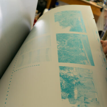
All of the images used in the book were sampled at 400dpi, and exactly fitted their allocated space (the picture frames). Each image was saved as a TIF file, 8bit, and has the corrected adjustments and we are in the CMYK profile the printer needs
I have the proof prints for each of the images in the book, so I have a reference when the book is printed
All of the information about the book’s publication is verified, and mentioned any external sources (book’s text, image of Apollo and Daphne, etc).
Decided on the paper that will be used. Galaxi Keramik, 170 gsm, and the cover is printed using the same paper (but at 130 gsm). The plethora of available paper is overwhelming, and I had seen this paper used in another book, and I liked its texture, it has a slight sheen to it, and the warmth of the paper isquite nice and I thought it would handle both the colour and B+W images well
After talking with the printer, I had also decided to print with a lacquer coating. This coating would just cover the print areas, so they make a separate plate for this when the sheets are printed. If you just cover the whole page with the lacquer, it will yellow the paper over time. It adds a slight gloss (that you can control) to the pictures, which helps to bring out the depth and detail I think. It does add cost (see… educational expense above!)
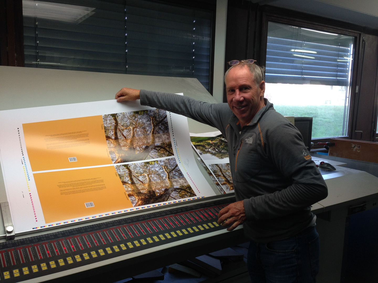
We have a date set for when the book is printed, and will be going to watch it being printed. I cannot recommend this strongly enough, you should be there when your book is printed.
The day arrives, I arrive at about 8am, and the first sheet is loaded, the ink dialed in and the test sheets have been printed. I had no idea what to expect, but straight away we go down and have a look at the sheet. I have the proofs with me, so we pull those out for the pages we have printed, comparing them with the print, and make some adjustments to the ink spread. Run off another sheet, compare again, make some more tweaks, run them off again. We are basically looking at the neutrality of the print with the proof as a reference (so, is the green truly green, or has it a cyan tinge, is the black strong enough so that the detail “pops”, etc… basically all the kinds of things you look at when going from the screen to a print).
Of interest here though was how important the proofs were, and as we had one of each image, it was very useful to have them, to be able to pull out the proofs for that sheet, and use them as a touchstone, and for the printers to use to set up the ink settings for each sheet. Then there becomes a bit of a balancing act, as any adjustments essentially effect all of the images on the sheet, so you have to really look at the ones you want to look the best, and use those as your key image(s) for that sheet. Drives home not only how the importance of getting the colours right in the proofs, but also ensuring that there is a balance across the whole range of the images, so that they all look like they belong with each other. By the time you are at the printing press, there’s little you can do to fix any problems.
I must say that what first struck me was just how strong and how much detail the prints were able to contain, the proofs (which were done on an inkjet – a top of the line one) looked somewhat soft in that regard, a lack of really fine definition. So, the advice about proofing was correct, and I still admit some surprise at just how sharp the offset printing was able to be; its worth a comparison of your own if you get the chance.
Now its crunch time, I’m being asked to sign off on the first sheet – yes, this is the one, these are the settings we will use. So, I sign off, and the print run is started. Its all over in about 10 minutes! Then the process starts for setting up the machine for the next sheet.
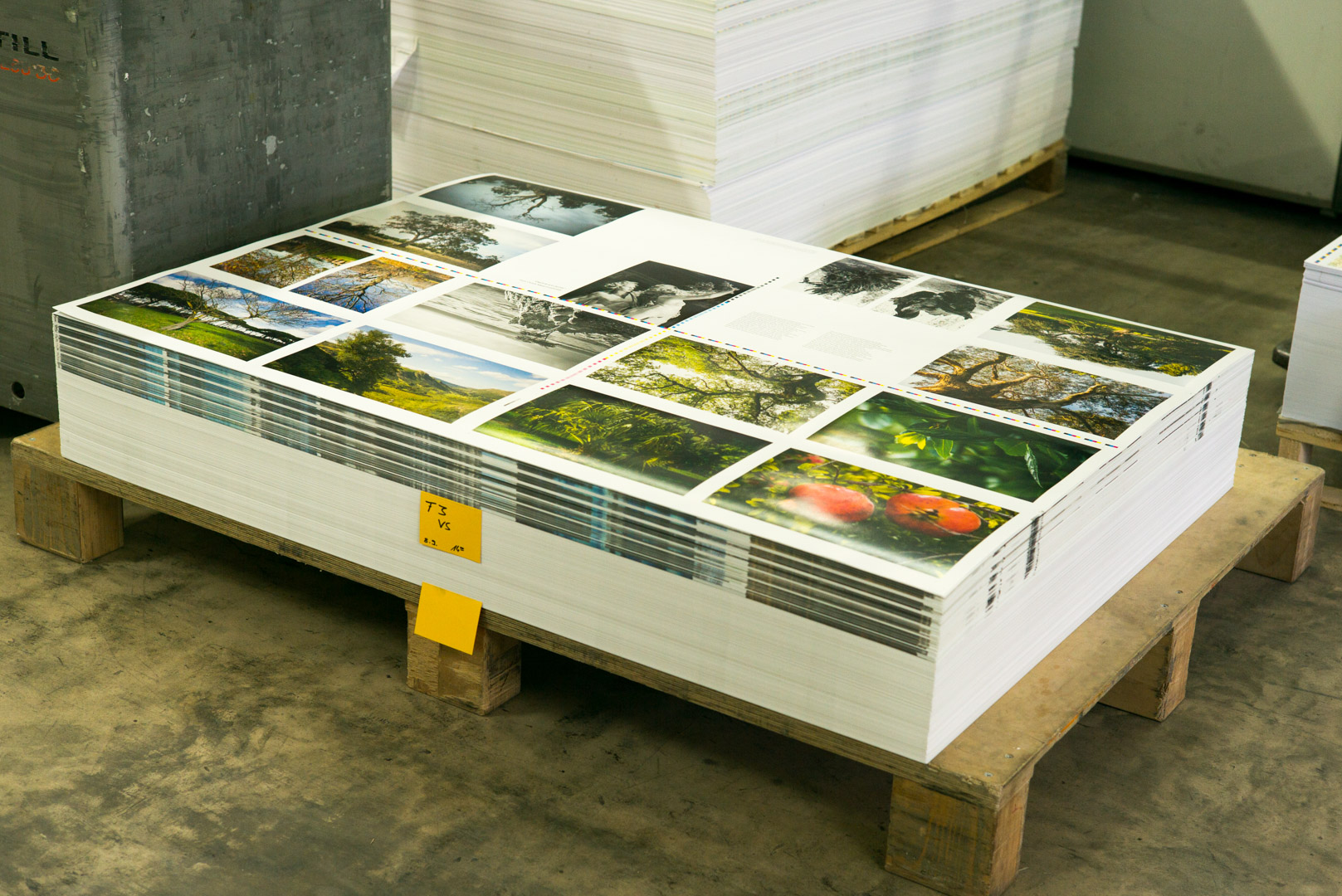
For the 96 pages, we print 6 sides, so 16 pages a side, 3 sheets in total. Each sheet will become 2 sections of the finished book, sewn together and bound, with 6 sections in total. While the book is printing, I just hurry up and wait really, its all in the hands of the printers, and then when they are ready with the next sheet, I go down there with Daniel, have a look, compare with the proofs, sign off, and wait for the next one. Its quite thrilling to see it coming off the press, and I’m sure there is something in the smell of the ink and the presses that is addictive, as I just want to come back and do this again!
At the end of the day we are finished with all the sheets, and there they are, stacked on a pallet ready for the binder.
The next day we print the cover, and they then grab a couple of sheets, and do a rough cut and fold so I actually have “the book” now in my hands, ready to go.
I can’t recommend strongly enough that you are there for the printing, just being able to tweak the final settings, seeing what images are harmed (or benefit) from the settings of any given sheet. There are some compromises you make here, and seeing this come out you also understand what adjustments you might make (and you should take notes!) if you do a second print run. And really, to be the one signing off, that these sheets become the reference for any consequent printing as well, is just cool. Oh, and yes, you really should have hard-copy proofs for any images you care about, otherwise you have no point of reference for the book print and its too hard to just look at the pictures and make decisions just on the moment. I don’t think the screen is helpful at that point, you should have enough memory of the basic prints, but it’s the printed detail that you have to look for, and that’s where the proofs really help.
With the pages printed, the final choices is the colour of the end pages (these are pages that are stuck on the inside covers and fold out to meet the spine), and then the colour of the little cloth that sits on top of the spine. For both I go for a blue, to bring out the blue in the sky of the cover photo, and a nice colour contrast to the gold of the back cover (which is keyed off the gold in the cover photo as well).
The binding process takes about 3 weeks, so there’s nothing much to do now but wait. I get 3 advance copies in a couple of weeks and I now have a bound copy in my hands: the reality of it all starts to hit home, and shortly I’ll have 300 books to store, distribute and sell.
8. Shipping
For the unwary (and I am happily included in this camp) this is really a nightmare. As they say: an army marches on its stomach: Logistics. I have books where each book weights 1.13 kg. Shipping costs are always going to be a major cost, as is any kind of storage costs that aren’t in your garage. This caught me somewhat unawares really, its not that I hadn’t thought about it (it was the main thing I’d been worried about, and why I only printed 300 copies to begin with), but still, it did catch me unawares. There is nothing like doing.
Rather than go through the number of false starts and miscalculations, I’ll just summarise the points I learnt, and where I ended up. This is not an exhaustive list by any means, I’m sure I’ll add to it before I’m done.
- (1) The real shipping costs are the local costs from door to port, port to door. The port to port costs are not significant. So, it ended up being about the same cost to ship by air to Australia from Germany, than to ship by sea, and the shorter transit time meant there was less time for damage to the stock to occur.
- (2) Any time you break up shipping into more than one shipment you pay. Its just about the same cost to ship 300 books to one destination as it is to send 80 books, as the books are packed on a palette, and the palette itself has a size and weight dimension that is basically triggered as soon as you put 1 book on it, or 300. So, I can send 4 shipments of 80 books each to the same destination and it will cost me pretty mcuh 4 times as much as one shipment of all the books. In other words, ship as few batches as you can. We have ended up shipping to 2 locations:
a. UK – to Albumen Gallery (more about this below)
b. Australia - (3) I had originally thought about shipping books to Amazon in the US, so that I would have some books locally in the US. When I first scoped this out, Amazon wanted the shipment broke up into 3 different fulfillment centres – which was prohibitively expensive (see above). I could have shipped to 1 location and then paid them a redistribution fee, but by the time I arrived at this solution (its not the default solution for them), I had also grown cold on the idea of having Amazon also store a large quantity of books; worried about the potential long term cost. So, having no local shipping support to the US, I decided not to do this afterall. I was also worried that without being “on the ground” in the US, my likely sales there would be minimal – I don’t really think I can drive that many sales to their web site at this point. That said, I have a few copies there, and will replenish those when they are sold.
So, we ended up with books at two locations, both locations supported by either myself in Melbourne or Stephan Schmid in London. Stephan runs Albumen Gallery, and this is the primary distribution location for the finished book: Trees: A Photographic Collection.
Distribution and shipping is still a huge problem I think – and as much as you read about the internet, Amazon (and its ilk), basically as an independent publisher the real elephant in the room is being able to tie into disribution and fulfillment services, so that both the book becomes known to people who would be interested in buying it, and we can get it to them, either through retail outlets, or online, at a cost that is reasonable and attractive. There is much here still to learn, so hopefully in a while I’ll have a second part to this article: how I sold my book!
The book can be purchased directly from Albumen Gallery and can be shipped world-wide.